Quick Poll: Preferred Logo Placement on Hats

Follow Thread

By Abby L.

  • 20 Likes
  • 66 Replies
  1. Abby L.

    Abby L.
    Providence, RI

    Team Titleist Staff

    Hey everyone - 

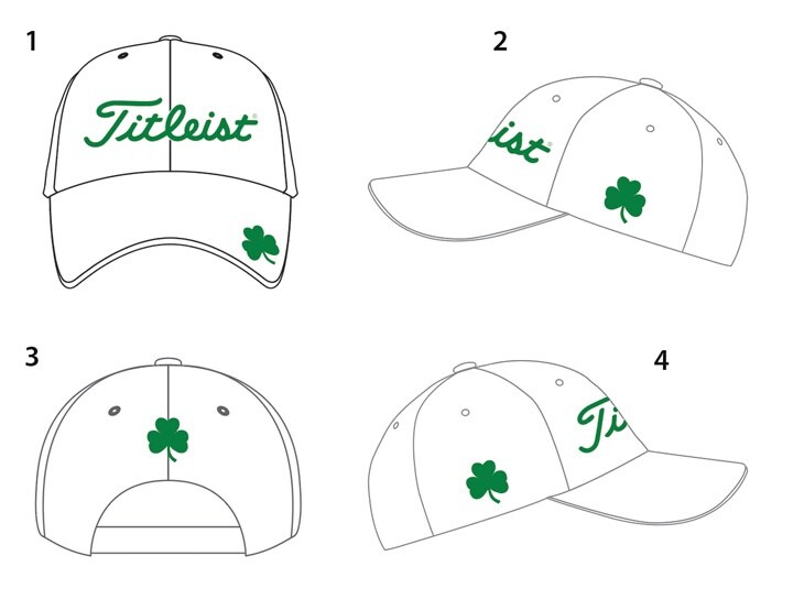
    Our gear team is already making it's preparations for the Titleist 2020 line of exclusive collections and we need your help! They are hoping to find out what YOU prefer for logo placement of our exclusive collections - such as the St. Patrick's Day limited edition collection they are running currently. 

    Take a look at the examples below and vote for your favorite version. Thanks in advance for your help! 

    Cheers, 

    Abby
    Team Titleist Staff 
  2. Tim W

    Tim W
    Elkhart, IN

    The Clover position on the back could look too similar to the Lucky brand.
  3. Jon R

    Jon R
    Allen, Texas

    Agree with this comment
  4. It's not a clover it's a shamrock
  5. Chuck Z

    Chuck Z
    Mt Pleasant, SC

    Military

    eoin l said:

    It's not a clover it's a shamrock

    A shamrock is a clover (lesser clover or white clover).....life is good..... with respect
  6. Looks really good!!!
  7. Any chance the hats can be fitted?
  8. Jeff Y.

    Jeff Y.
    Clarksville, TN

    Great options here Abbey, looking forward to the new gear and possibly a new bag tag
  9. I’m big on the LEFT side
  10. simon w

    simon w
    Chester-me-street

    All look good ! Back looks the best.
  11. I think putting it on the lid is the best spot. That way it won't effect the way the hat fits on your head.
  12. Titleist Fan 179

    Titleist Fan 179
    Middleburg hts, OH

    cant wait til Abby sends me one ;)
  13. The back is a great look and maybe have the team Titleist logo next to it or even above
  14. Marc S

    Marc S
    San Antonio, TX

    Military
    Any release logo would look good on the back, but... I think the LARGE TT Logo would look absolutely incredible on the back with a large release logo on the sides. Is it a consideration to add the TT logo to all releases? Please ;).
  15. I would have the clover in all this position
  16. Great job thanks for asking for feed back
  17. I like any extra logo to be on the back. I'm not a big fan of loading up the sides of a hat or shirt with extra logos. The logo on the front panel is all I need or want. If there needs to be another, one small logo on the back works.
  18. Awesome look.
  19. Positioning the logo on the back like in #3 gives a really nice symmetry.
  20. I prefer either the back or side because I usually have a ball marker on the lid
  21. Would really like to see it on lid and the back keep up the great work guys Mark
  22. Blair W

    Blair W
    Wilmington, NC

    Love this hat, hopefully it brings TT members a lot of luck!
  23. Dr. Kovatchian

    Dr. Kovatchian
    Carlsbad

    Number 3 works for me.
    Cheers,
    Dr. K
  24. Class you could also put St.Paddys Day above the shamrock
  1. 1
  2. 2
  3. 3
  4. 4
  5. Next

Please login to post a comment.

Sign In

Haven't registered for Team Titleist yet?

Sign Up